


♥♥♥♥♥
A really fun and open challenge this week at The Kraft Journal -
Your favorite color with Kraft !!
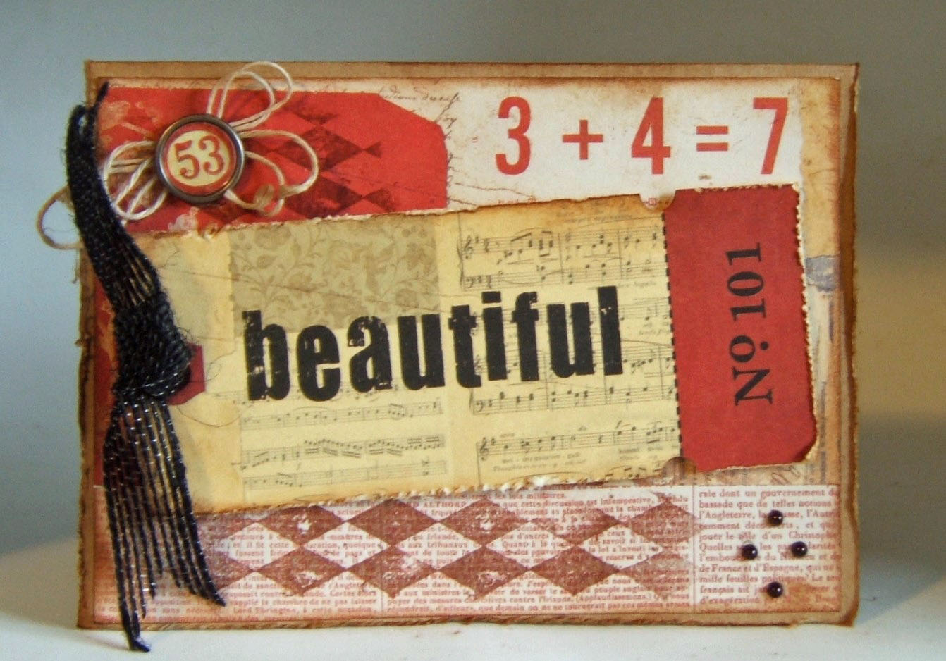 | |||||
I love white with kraft the best, but since we did that combo a couple
of weeks ago, I chose red as the next favorite with kraft. I used a
couple of themes here, both numbers and harlequin shapes, to tie things
together. I also included the inside, as this is a card meant for
someone who needs to be reminded she is so beautiful.
The humble beginning of this card is the always useful Kraft Note Card. Adhered to that is some design paper, stamped with harlequin shapes. The "beautiful" Lille Tag was distressed, inked and threaded with Black Burlap Ribbon. Another harlequin shape was added with pearls, and a Custom Fastener with another number was attached atop, bowed with Natural Hemp Cord. The edges were inked and distressed.

I made a very simple inside, with more of the harlequin stamp, another Lille Tag, and one more numbered Custom Fastener.
The Kraft Journal has great challenges each week, and a tutorial each Wednesday. Hope you were inspired by this card - I made it for someone very special !!
All Kraft Outlet supplies are linked above
Other supplies:
Design Paper - 7 Gypsies
Stamp - Tim Holtz
Pearls - Recollections
Ink - Ranger distress, Versafine
♥♥♥♥♥
Agreed that red and Kraft look great together, especially in your vintage vibe card!
ReplyDelete